T Mobile - Times Square 3D Billboard
T-MOBILE
2022 TIME SQUARE ANAMORPHIC BILLBOARD
T-MOBIL’s IMMERSIVE LOGO EXPERIENCE FOR CUSTOMERS
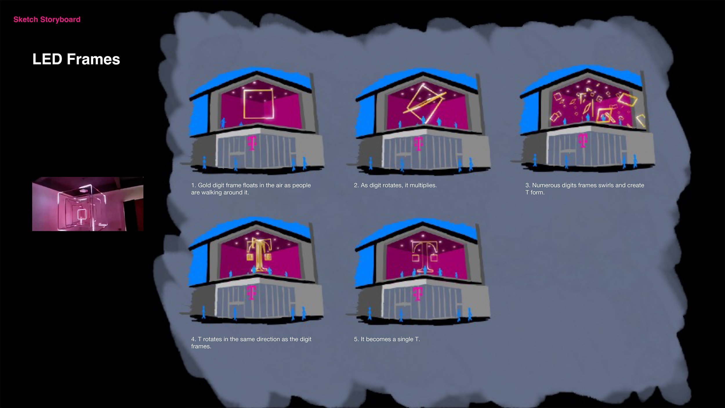
Two large T-Mobile-owned billboard displays were installed on T-Mobile’s signature store in New York. WONGDOODY created an anamorphic illusion projection that was appropriately titled T-Fill. Usually, anamorphic screens consist of two different-sized screens which one screen being wider than the other. However, the two T-Mobile billboard display sizes are the same the consequently required a specific and unique art direction to make the graphic look accurate.
ISSUES
PROBLEM 1. TWO IDENTICAL SCREENS
It was challenging to achieve the right anamorphic look on the T-Mobile-owned Time Square Billboard because both screen sizes are nearly identical and this means that the content needs to EXTEND across the line between the two angled screens. Therefore, it was necessary to figure out how to have less distortion while completing the art direction.
PROBLEM 2. LIMITED VIEWING ANGLE
From certain angles, we had a good view of the content; however, the object between the screens became easily distorted depending on a person’s point of view as they moved from right to left.
ART DIRECTION
Based on the research with this anamorphic screen, it is the conclusion that it is better to not put objects and logos across the corner. However, it is okay for OBJECTS OR LOGOS to be towards the left or the right. Additionally, in the corner area between the two screens, the visual should be more organic as this helps with the illusion effect. Therefore, we got rid of the T5G and moved the T to move from the left to the right.
Creative Director: Monkey Watson; Art Director: Lena Lee; Designer: Jason Williams


